Website feedback tools are a simple and inexpensive way for you to gather customer feedback. You can use this feedback to fix urgent bugs, improve your user experience and surface customer ideas.
However, you’ll get the best results from a feedback tool if you use it for a strategic task, rather than just to collect general feedback across all your web channels.
- Feedback tool for web portals
- Feedback tool for website widgets
- Feedback tool for sections of your website
- Feedback tool for online courses
- Feedback tool for beta web projects
Feedback tool for web portals
Web portals are a great way to provide employees, customers or suppliers with a single access point to information. This information is usually private and can only be accessed with a username and password.
Web portal examples include: student enrollment portal, sales portal, customer self-service portal, membership portal, CRM portal, intranet portal and corporate portal.
This is an example of a customer ‘self-service’ portal:
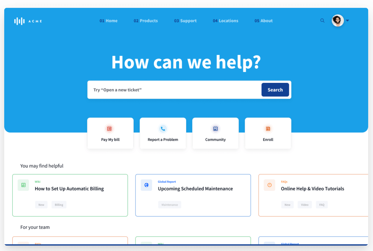
However, web portals require improvement and maintenance. You’ll come across these problems on a fairly regular basis:
- Technical problems, including bugs
- Content mistakes and inaccuracies
- Usability issues
- General questions and queries
Some of these issues will get flagged up by your traditional outreach methods, like phone or email. Others might get mentioned on social media or a chat channel.
However, user feedback will be spread across many feedback channels and problems may go unnoticed. Technical issues also take more time to resolve because you have to go back and forth getting the exact feedback you need from users.
Sound familiar?
This is why feedback tools for web portals are a good investment. They help you collect actionable feedback in one place.
Western Governors University (WGU) case study
WGU use a feedback tool (Saber Feedback) as an integral part of their student enrollment portal. Enrollment operations manager Paul Donoghue explains:
Saber Feedback is the way that our students provide (typically technical issue) feedback through their WGU Enrollment Portal. Although they do often use it for questions/concerns intended for their Enrollment Counselor or sometimes the Financial Aid office or another department as well.
It helps our tech team monitor any issues on the portal and also provides an additional method of outreach besides email/phone.
What to look for in a web portal feedback tool
- A tool that is easy to use, so your users can give feedback when they come across a problem
- A tool that sends feedback to a place that makes sense for your team – if you don’t want to look at another new dashboard then choose a feedback tool that connects to your project management or customer service tools
- A tool that supports screenshot functionality, so your users can quickly show you what they mean
- A tool that automatically includes metadata like customer URL, browser type and version, device and Javascript errors, so your support team can quickly identify the problem without having to ask for more information
- A tool that you can customise to ask for certain types of feedback
Feedback tool for website widgets
You can use website widgets to generate leads, clarify information or offer your users a personalised experience. Because these widgets have a specific aim, offering a specialised feedback experience will help your users successfully complete the task.
Confused.com case study
In this example, Confused.com wants users to successfully get a quote on car insurance. The feedback button is there in case they run into problems.
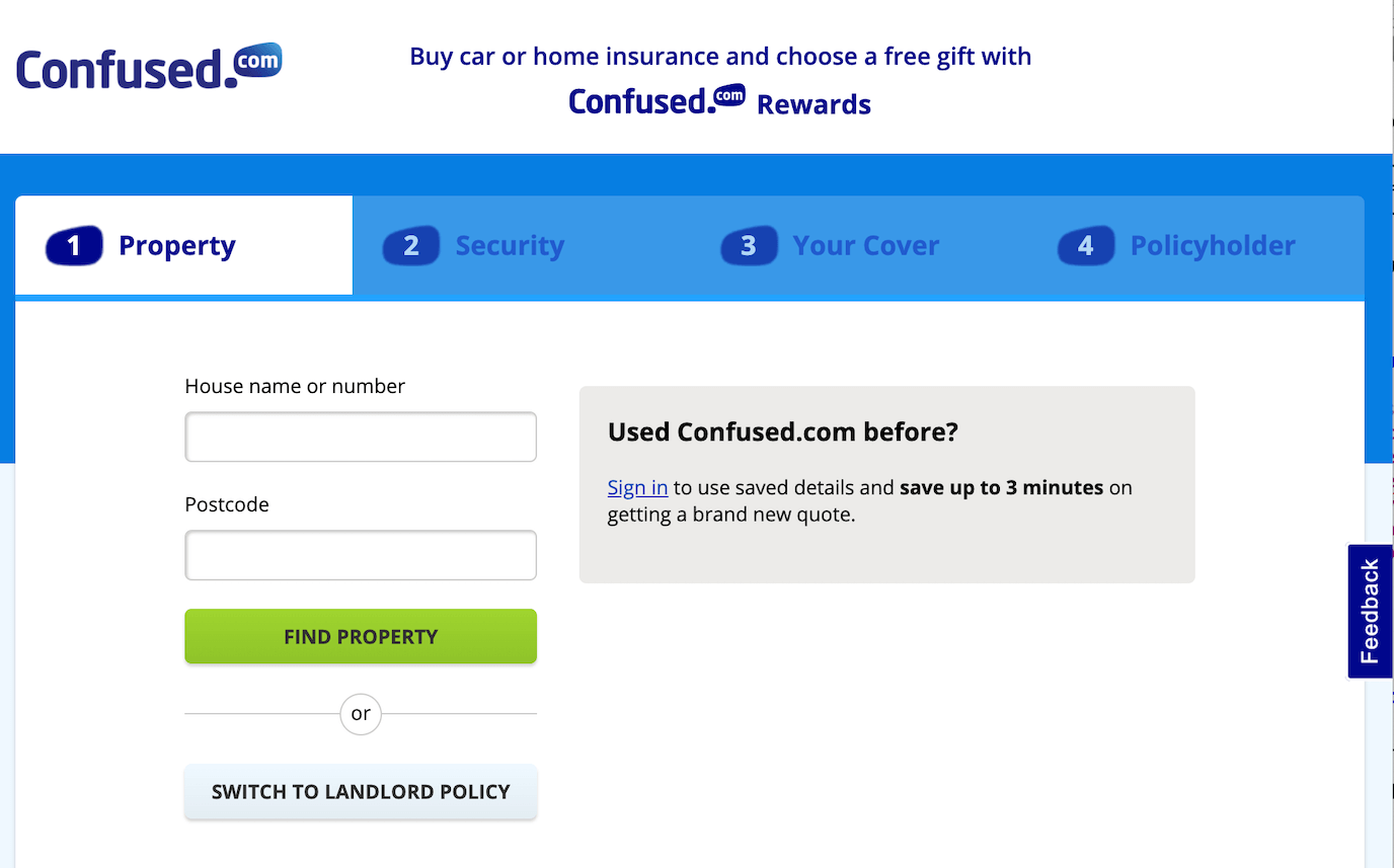
If a user clicks on the feedback button they see this form:
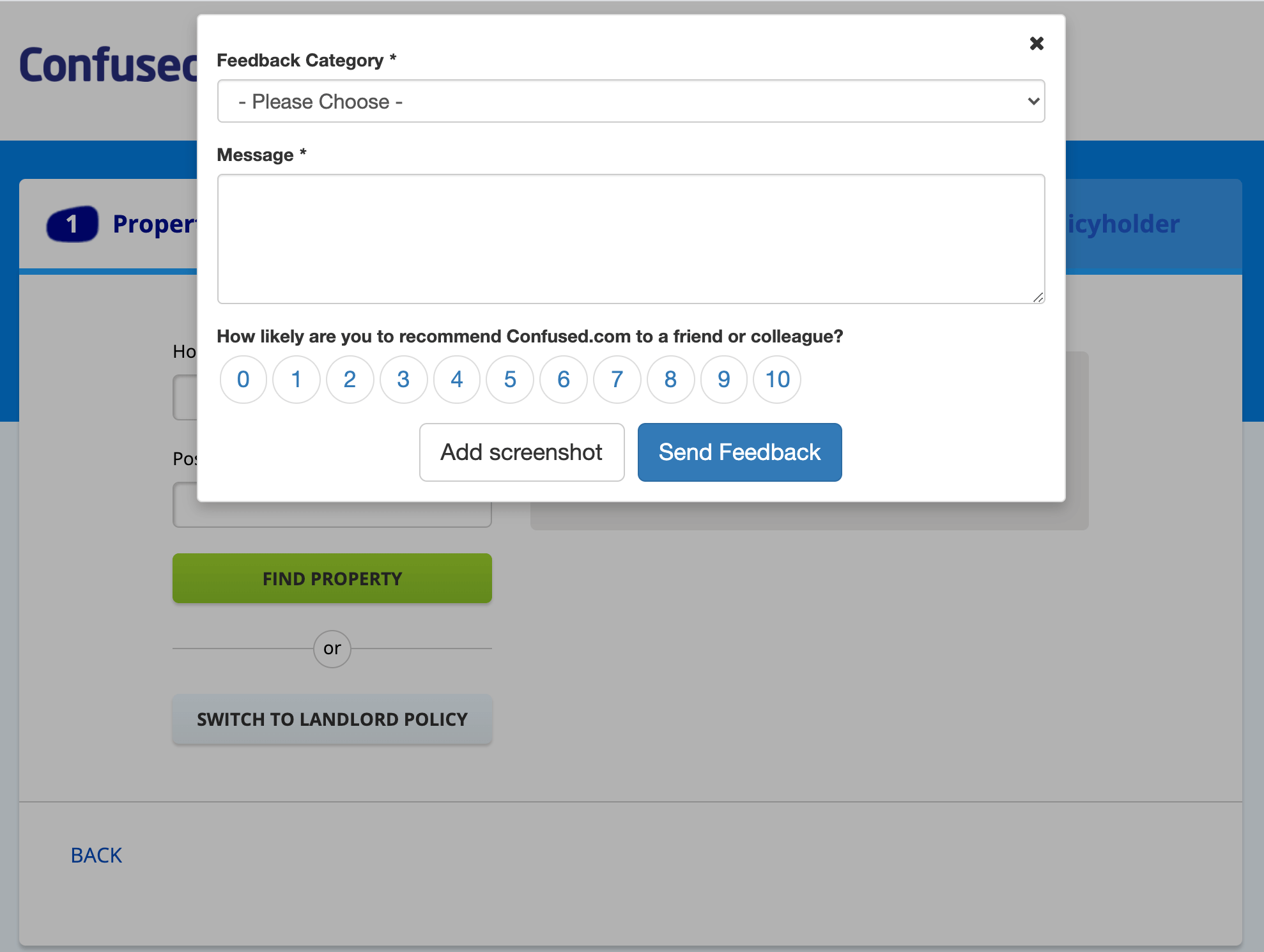
Users can report any problems or ask questions. They can also quickly give a satisfaction rating, which allows Confused.com to keep track of how happy their users are with the web experience.
Chat bots vs a feedback tool
Would you be better using a chat bot rather than a feedback tool to support a website widget?
Chat bots are useful if they help your users ‘self-service’ and save your customer support team time. However, they are only as good as the information you feed them. If you set up the expectation of giving customers an instant answer to their question only to provide automated, unhelpful information you will end up with a disappointed user.
Chat bots are also limited in what they can deal with. If your user wants to report a technical problem, for example, they are usually not very helpful. They don’t often support screenshots or capture meta information that will help developers diagnose and fix an issue.
Live chat tools offer a better user experience than chat bots, but they require you to have customer support staff on hand 24/7. This makes them a better choice for bigger companies.
Feedback tools are not ‘interactive’ in the same way as chat bots, but they will simplify the job of your help team and provide a sensible and helpful user experience.
In this article we compare chat bots, feedback buttons and contact us pages.
What to look for in a web widget feedback tool
- A tool that is triggered by your users - these don’t get in the way of users who are successfully completing a task, unlike pop ups
- A tool with a flexible form builder that allows you to get the information you need in a user-friendly way
- A tool that integrates with your help desk or project management software, or sends feedback by email, so you don’t spend longer than necessary processing feedback
Feedback tool for sections of your website
Although some simple feedback tools only work on all your website pages, you’re better choosing a tool that is more flexible. The needs of your users on your homepage, for example, can be different to those of your users on other more specialised content pages.
This feedback button is on the technical reference section of the Omega website:
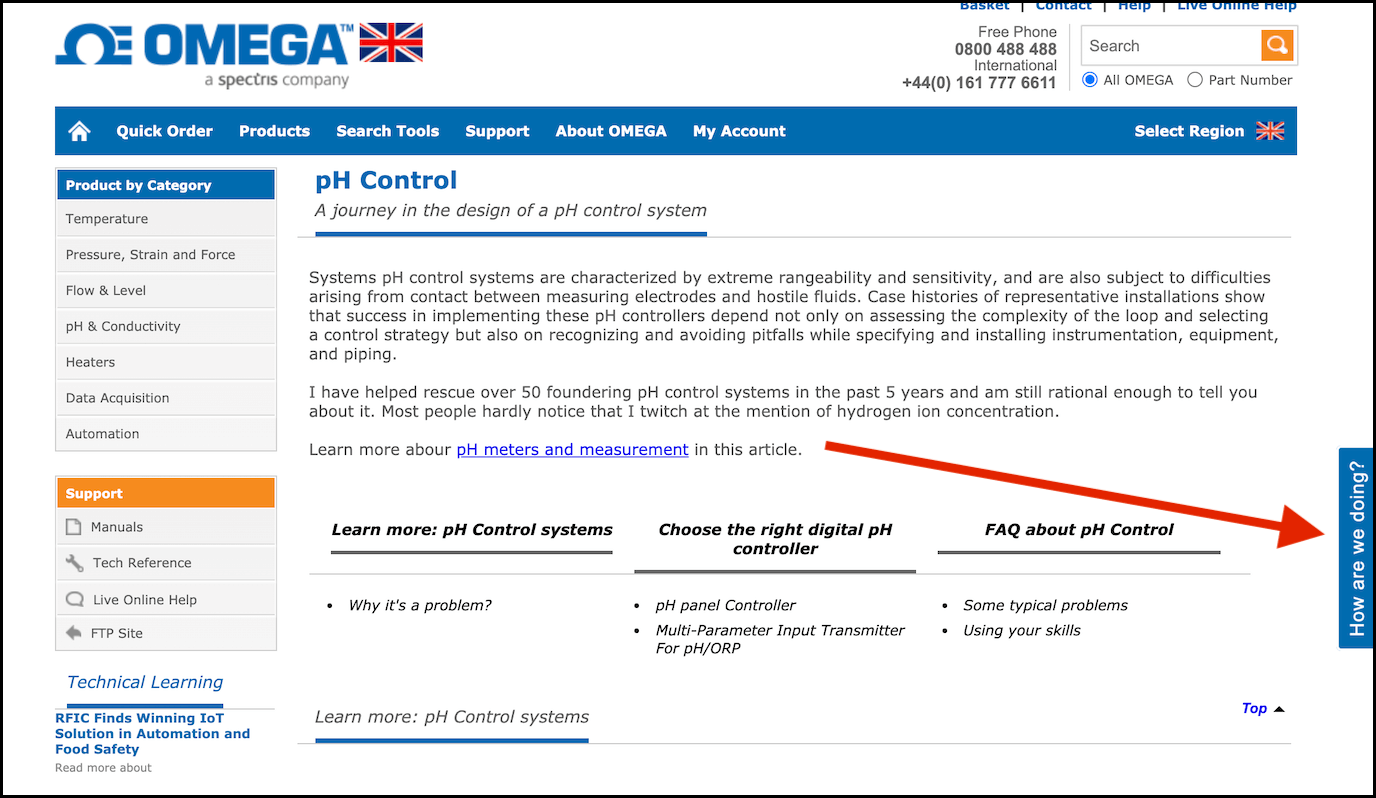
In fact, it is rare for a feedback button on a homepage to be useful. If your users have just arrived to your site, then their priority is having a quick look at your content to check whether your product will solve their problem.
Presenting them instead with the option to give feedback, ask for help, or sign up to a newsletter can be an unwelcome distraction. They are too early in the sales funnel for these options.
Instead, you can use feedback buttons on specific sections of your website, or on a smaller, related website with a specific job.
Typing Master case study
The main website for Typing Master signposts all their products, including a number of typing games, downloads and courses.
However, if you choose ‘Play free typing games’ you are taken to a smaller, linked website called typinggames.zone. This website has a feedback button.
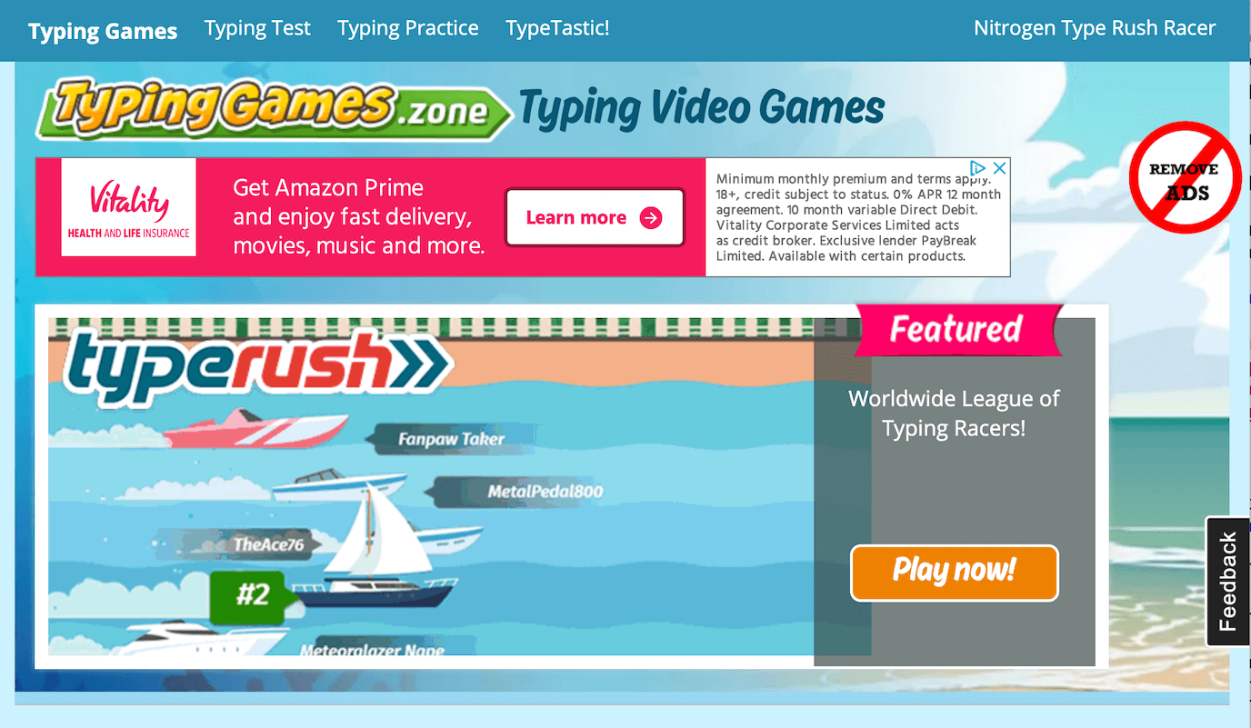
The feedback button is used to catch problems with users who specifically want to play the games. They might be experiencing a technical problem, for example. This is a different use case to people on the home page, who are working out what Typing Master is and does.
What to look for in a website feedback tool
- The ability to use the feedback tool on certain sections of your website or on one of your websites only
- Feedback tools that support screenshots – this type of feedback is simpler for your users and customer support team
- Feedback tools where the button can be customised (instead of saying ‘feedback’, ‘How are we doing?’ or ‘Report a bug’ might be more suitable)
Feedback tool for online courses
Feedback tools are a great way of getting early-stage feedback on your online course. You can identify areas of weakness that might lead to poor satisfaction ratings. Feedback tools can also be used to ask students for ‘high level’ feedback about how they would like to see the course developed, so you don’t just rely on your own judgement.
Even when your course is mature and selling, a feedback tool can still be useful. You can use one to pick up bugs, content mistakes and inaccuracies that make your course look outdated and unloved. Trying to identify these issues yourself on a 200+ page course is a massive task. So why not encourage your students to help? Showing that you care about keeping the course as professional and useful as possible should also help boost customer satisfaction.
Feedback tools can also be used as a quick way to measure student satisfaction at different points in your course. This can help you keep track of customer sentiment, and spot any alarming trends.
This article on How you can improve your online course so you sell more contains a section on getting feedback.
AICPA case study
AICPA is the world’s largest member association representing the accounting profession. They run the Finance Leadership Programme which is an online learning platform for students trying to get their CGMA Designation. They use a feedback tool called Saber Feedback.
Christopher Roberts, learner success manager at AICPA, says:
When the programme was new and we were still building it, we wanted to add new features. So we initially asked students going through the programme to suggest improvement ideas through Saber Feedback.
Now, we mainly use Saber Feedback for content issues, so if a student comes across something they don’t think is right, or working, or a typo, it’s really great for that type of feedback.
What to look for in an online course feedback tool
- Flexible, so it can be used on course pages as well as on a customer dashboard
- Platform agnostic, so it works on your course
- Customisable, so you can initially ask for high level feedback, then use a feedback form to identify mistakes and inaccuracies, and perhaps also do a quick satisfaction survey – all using the same tool
Feedback tool for beta web projects
Feedback tools are really useful when you’re working on a beta web project that requires feedback from different people, some of whom might not be very technical.
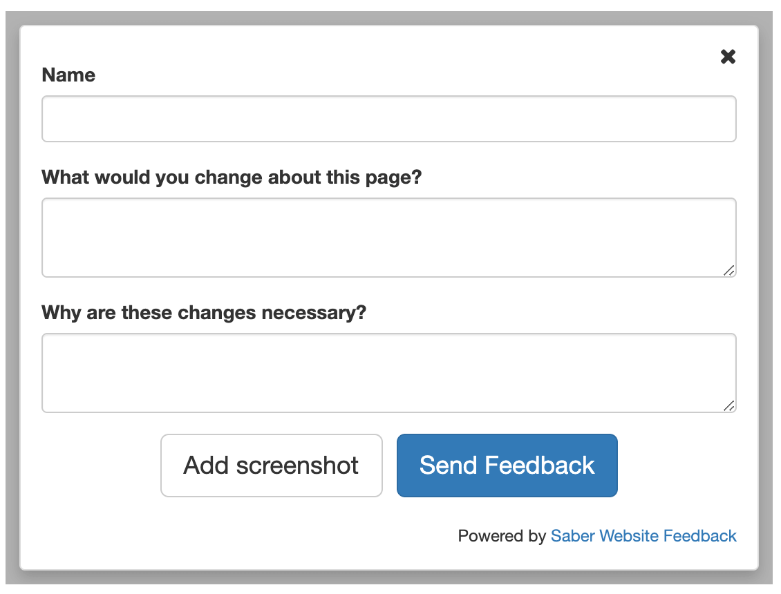
It can be overwhelming having feedback come through different channels, as well as people struggling to identify the exact item they want to comment on.
By using a feedback tool with screenshot functionality, you can make sure all your team and stakeholders can quickly identify problem areas, as well as collect feedback in one place.
Some feedback tools also support integrations.
These are the most popular integrations supported by Saber Feedback:
Screenshot functionality – how it works
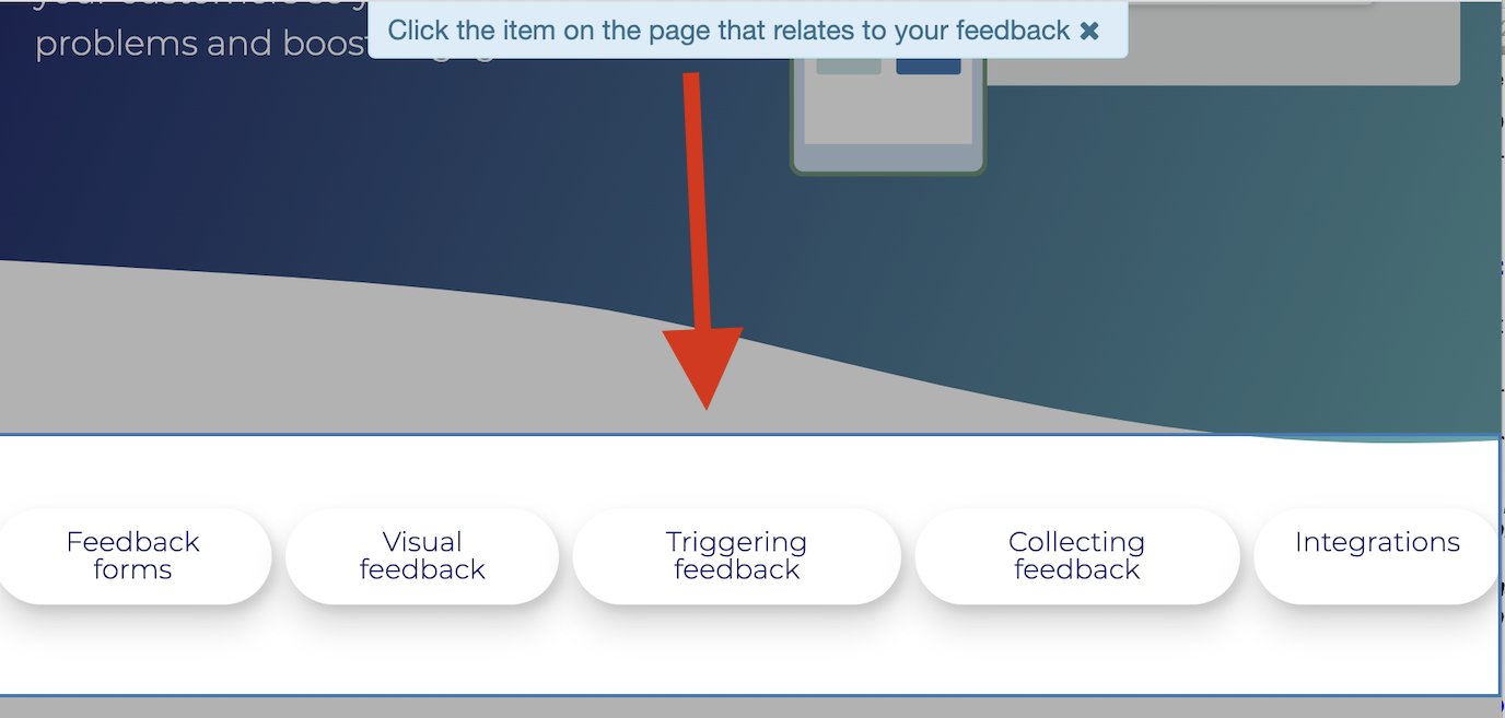
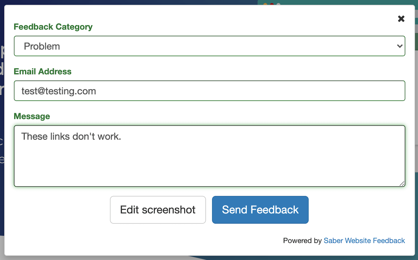
This example shows how the Saber Feedback screenshot functionality works. Each form has an ‘Add Screenshot’ button that can be selected. In this instance, we want to show that the link buttons are not working.
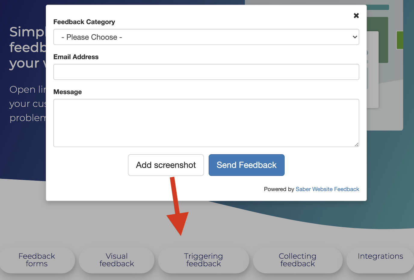
You’re asked to select the item you want to send feedback about. In this case, I’ve highlighted all the links.
Then I can add a message explaining the problem:
What to look for in a beta website feedback tool
- A tool that can work on staging websites or on a developer’s local machine
- A tool with screenshot functionality
- A tool with integrations if you don’t want to use another dashboard for feedback
- A tool that is easy for your team and stakeholders to use, and that doesn’t require them to download anything
Try Saber Feedback – a flexible feedback tool with a 30-day free trial
Saber Feedback is designed to be easy for you to install, customise and connect to your other tools.
It supports screenshot functionality, as well as useful meta information about your users and their specific tech set up.
It has enough flexibility to be useful, but without all the extra complexity that adds to the workload of your team.


