A feedback button is a discreet tab that is visible on your website, online course or web app. A feedback button allows your customers to give you instant on-page feedback when they encounter a problem or have an idea.
You can use feedback buttons to fix bugs and mistakes, spot usability problems and identify growth opportunities.
The video version of this page
- How do feedback buttons work?
- What are the benefits of using a feedback button?
- Where can you use a feedback button?
- How can you use a feedback button?
- How are feedback button tools different?
- How can you install a feedback button?
- What feedback form will work best for you?
- How can you improve the performance of feedback buttons?
- Try Saber Feedback – 30-day free trial
How do feedback buttons work?
Feedback buttons sit to the side of your web page. When your users click on them, a feedback form appears.
A feedback form is an overlay that pops up or slides in. Feedback forms triggered by feedback buttons are usually fairly simple with no more than a few questions.
What are the benefits of using a feedback button?
Using a feedback button on your website has many benefits. Here are the main ones:
- Shows your customers that you welcome feedback and are serious about listening to what they have to say
- Makes it easy for users to give you instant feedback, rather than requiring them to leave the page they are on to hunt for your contact details
- Provides a visible but discreet feedback channel that doesn’t get in the way of users performing other useful actions
- Delivers feedback into a private channel under your control, rather than users publicly discussing problems on social media
- Helps you understand customer preferences and pain points that might be preventing your business growing.
- Can identify usability issues, content mistakes and bugs that are affecting your conversion rate.
In this example, the feedback form helps you spot usability problems:
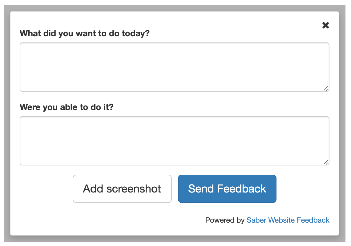
Feedback buttons can save your customer support team time. This is the case if you choose a feedback button tool that makes it easy for your team to identify problems without going back and forth with customers, or having to navigate between dashboards.
In this article, we look at how a feedback button improves the customer support experience offered by Zendesk.
Where can you use a feedback button?
You can use a feedback button on websites, web apps, web portals, beta websites, and on both the dashboard and individual pages of online courses.
This feedback button is on the technical reference section of the Omega website:
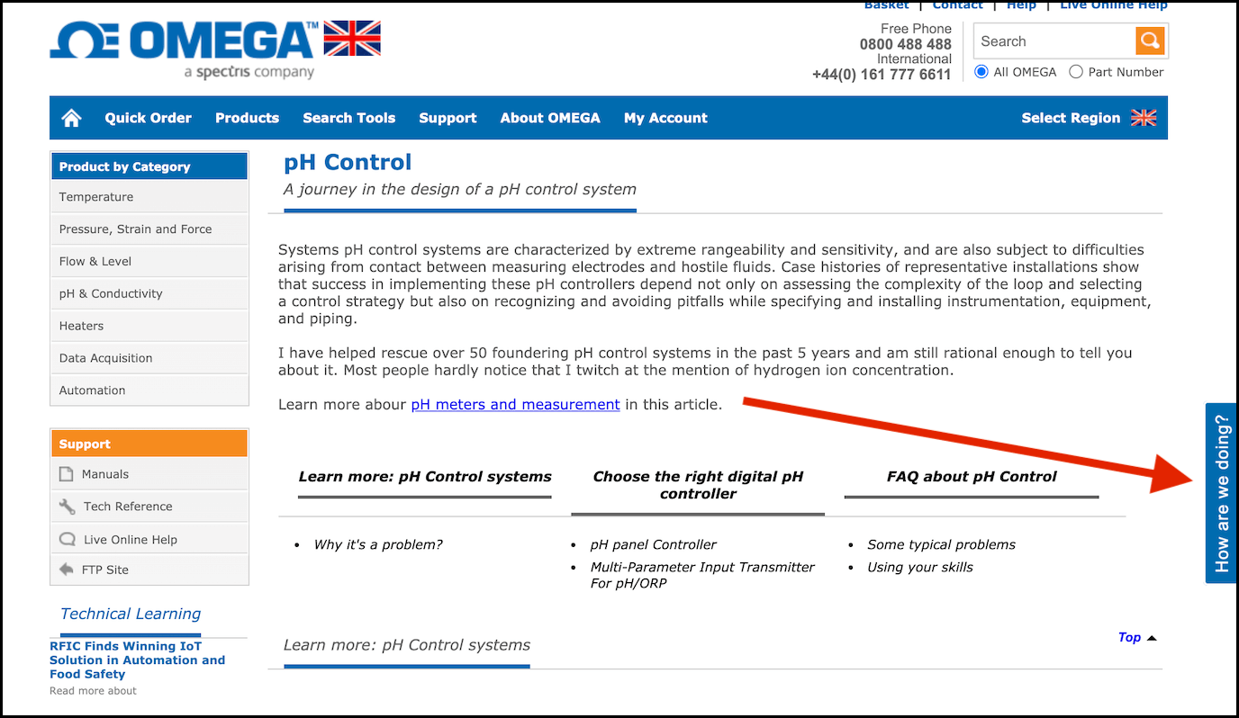
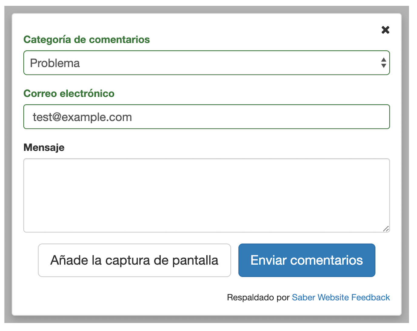
Feedback buttons are flexible and simple tools that should fit in with your requirements. Some are available in different languages, so you can collect feedback from all your customers, rather than just those that speak English.
How can you use a feedback button?
You can use a feedback button on all pages of your website, online course or web app. This ensures users can always give you feedback, no matter where they are.
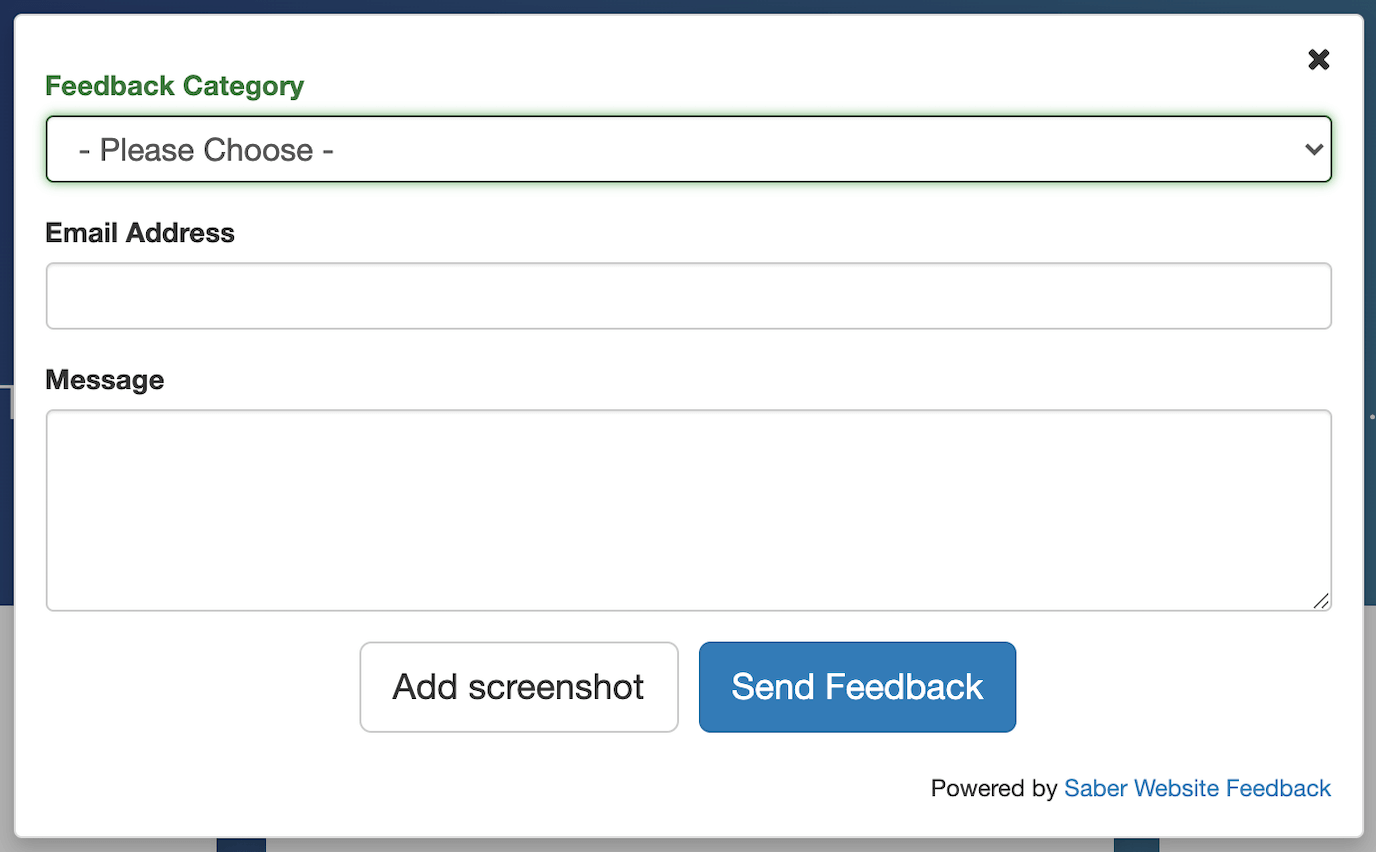
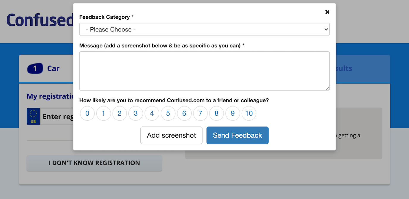
However, this approach is quite general and requires a form like the following:
Many companies prefer instead to use feedback buttons on certain pages, where customers are trying to perform a specific action.
In this example, Confused.com wants users to successfully get a quote on car insurance. The feedback button is available in case they run into problems.
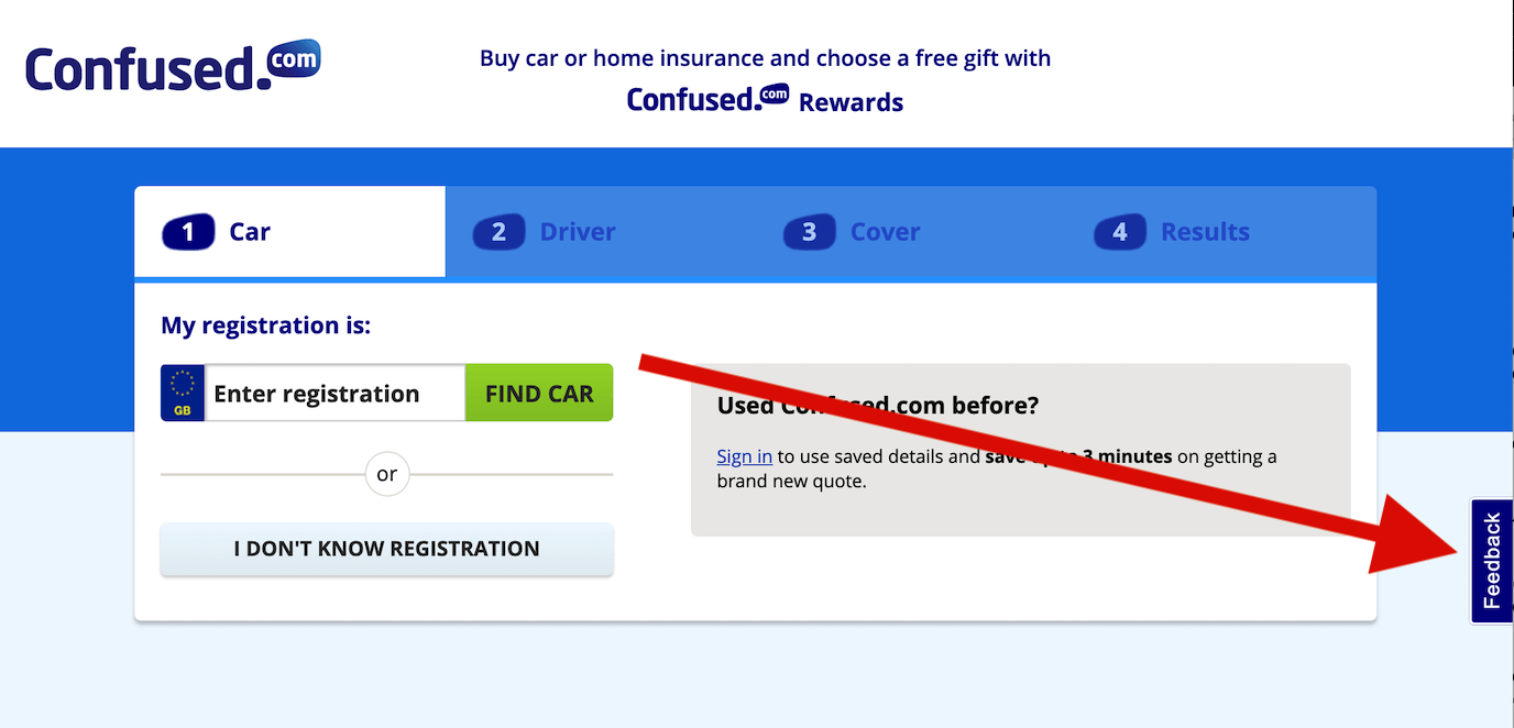
In this example, CodersRank wants an easy way for users to give feedback on a ‘Top Developers’ leaderboard. They don’t use a feedback button on their marketing pages, because casual site visitors will give different feedback to engaged developers focused on a specific goal.

In this case study, Christopher Roberts, learner success manager at AICPA shows how they use a feedback button.
Students can give feedback on their landing page, which is a dashboard area, or throughout the learning. So everywhere in the programme they have the ability to give feedback. We use one form that autopopulates a student’s email address, which they use to login to our programme. The form has a text box where they can fill in their comments and gives them the ability to take a screenshot.
How are feedback button tools different?
Most feedback buttons share similar basic functionality. However, they differ substantially in the overall experience they offer you and your users.
Here are some differences to look out for:
Screenshot feedback
Some feedback button providers allow your users to take screenshots of the web page. This eliminates confusion, makes it quicker for users to give feedback, and saves your team some time when processing that feedback.
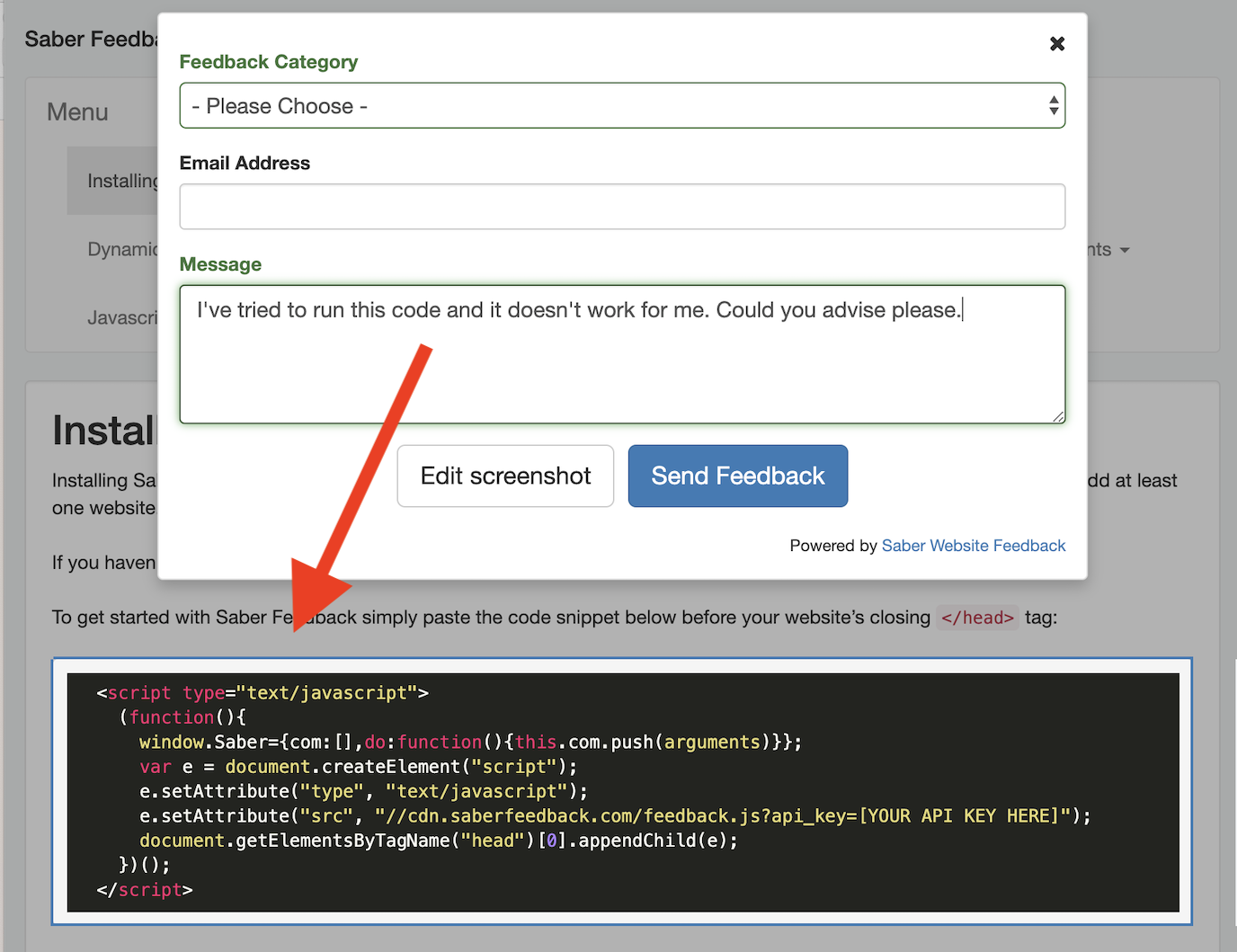
Here’s our article on visual feedback tools, including 4 feedback tools for you to consider.
Meta information
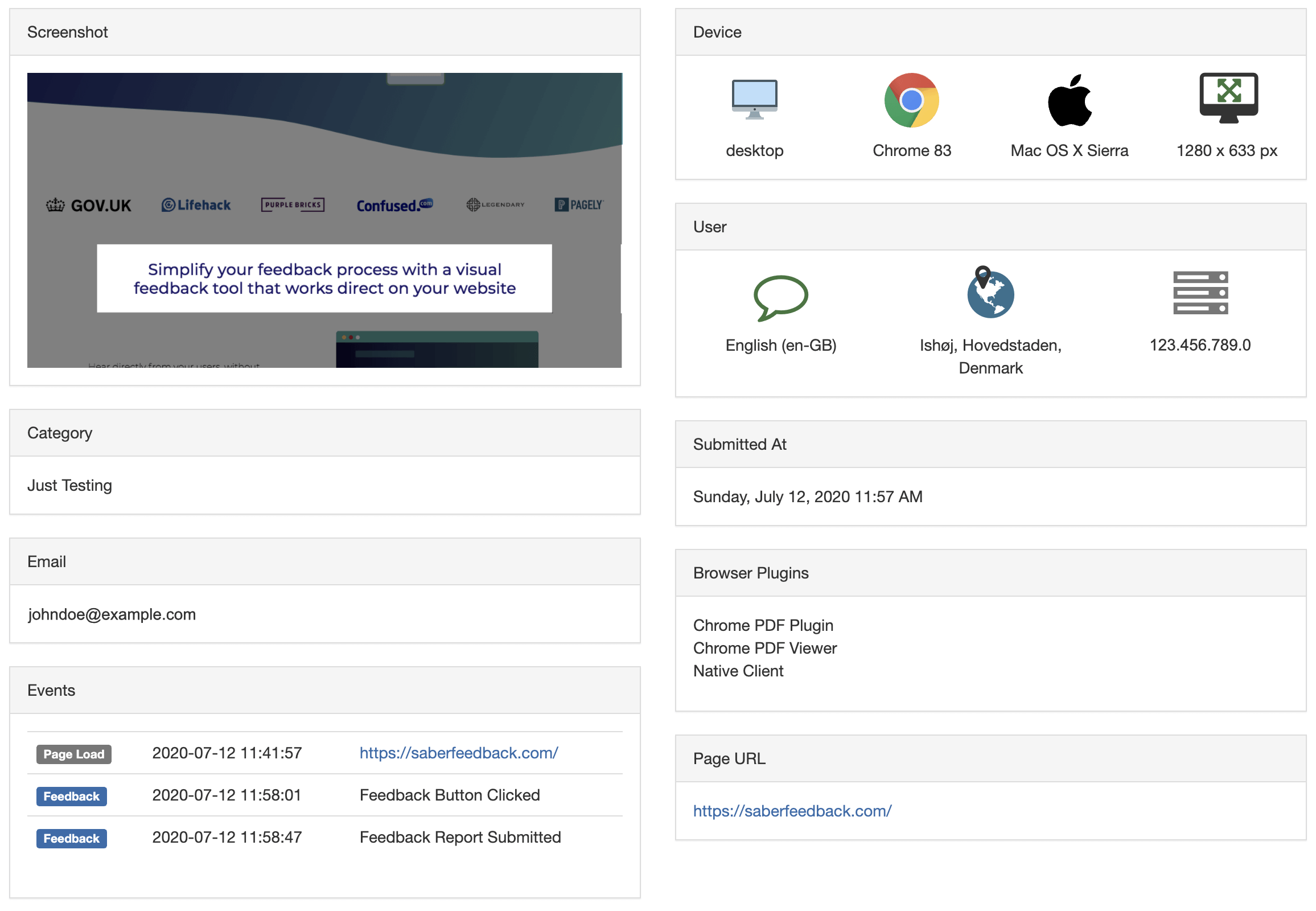
All feedback button tools should provide some kind of customisable feedback form. Some automatically capture information that is helpful to your team in diagnosing and fixing problems. This meta information includes:
- Information about the user’s device
- Information about the user, such as IP address and location
- Browser plugins
- Page URL
- When the feedback was submitted
- JavaScript events that occurred before the feedback was submitted
Platform agnostic or designed for certain environments only
Some feedback button tools work anywhere. Others are designed for specific environments.
For example, many feedback button tools only work on WordPress websites.
Some feedback button tools are more flexible. The Saber Feedback button can be used on most learning management systems, including Moodle. It can be used on Shopify and other ecommerce sites. There is also a WordPress plugin. However, it doesn’t work within emails and in-app.
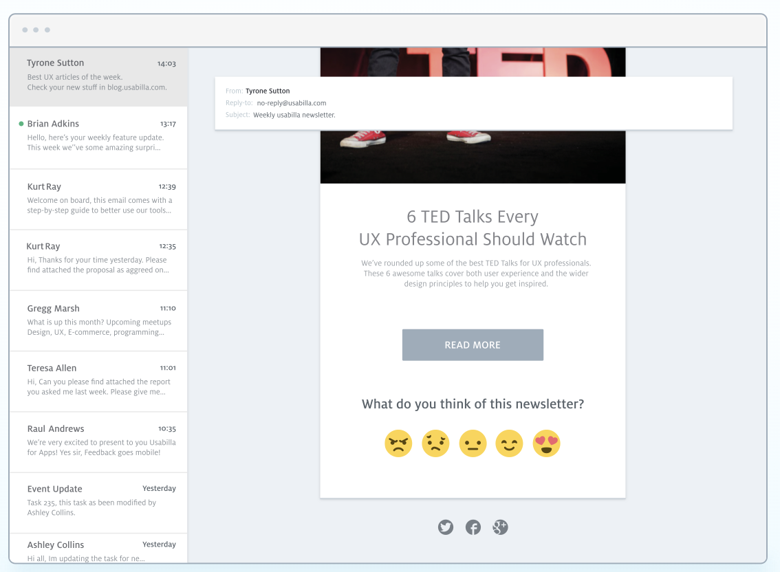
The Usabilla feedback tool can be used in-app and on emails as well. It works in these environments using rules though, rather than user-led feedback buttons.
How you process feedback (including integrations)
Feedback button tools differ substantially in how they let you process feedback.
Look out for these options:
- A feedback button that sends feedback straight to a dashboard with some kind of search function, export option, and analytics
- A feedback button that sends feedback straight to an email account of your choice
- A feedback button that connects with your favourite tools, such as Jira, Trello, Zendesk or Slack, and sends feedback straight to these
Some feedback button tools, such as Saber Feedback, supports all these options. Others support only one.
How can you install a feedback button?
Website feedback buttons should be easy to install. Most usually involve pasting a snippet of code into your website. You might need help from your web developer to do this.
This is the usual installation process:
- Get widget code from the feedback tool of your choice
- Paste into your website’s HTML
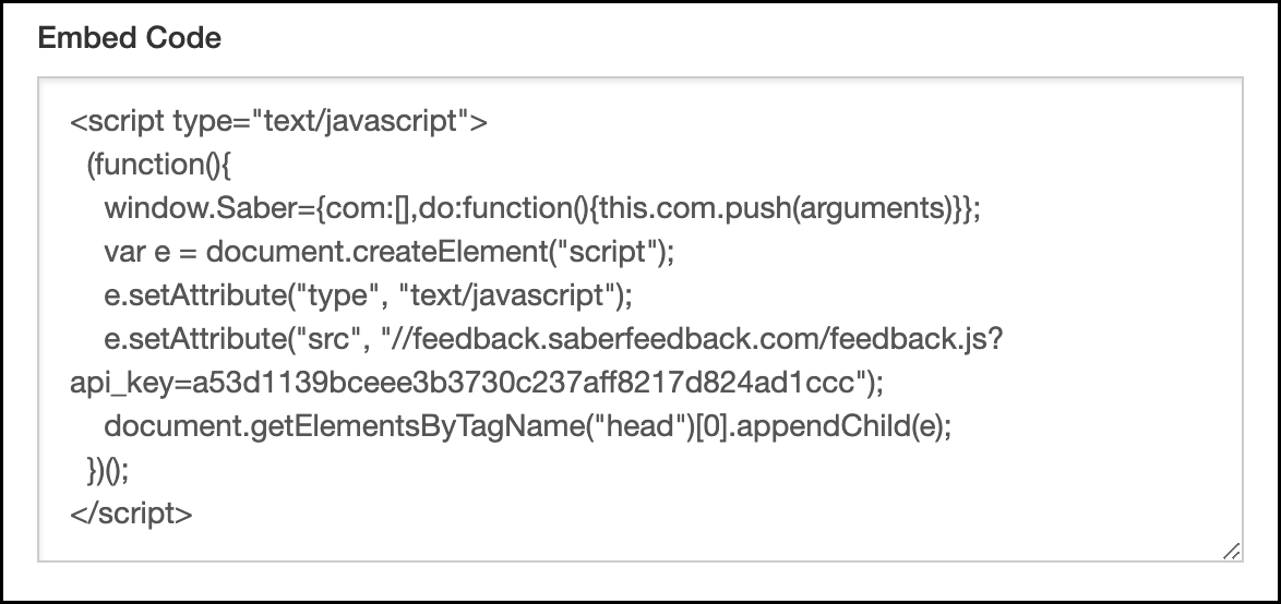 The feedback widget code usually looks a bit like this
This is usually all it takes to install a feedback widget. You’ll now see a feedback button or similar on your website.
What feedback form will work best for you?
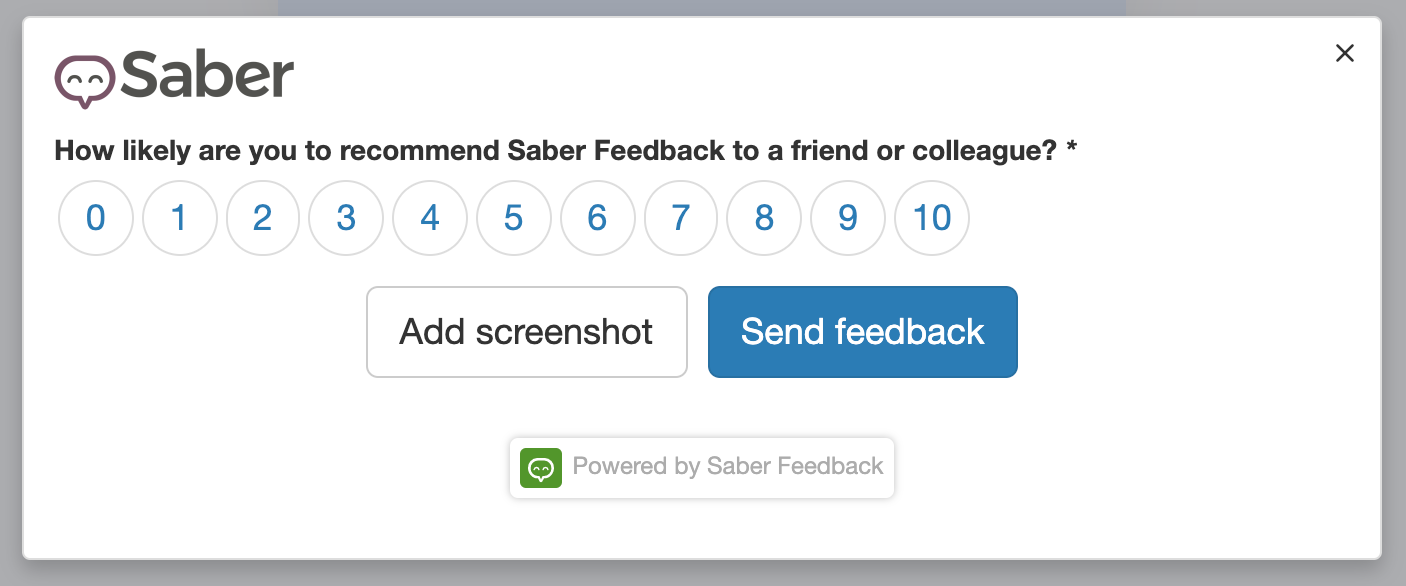
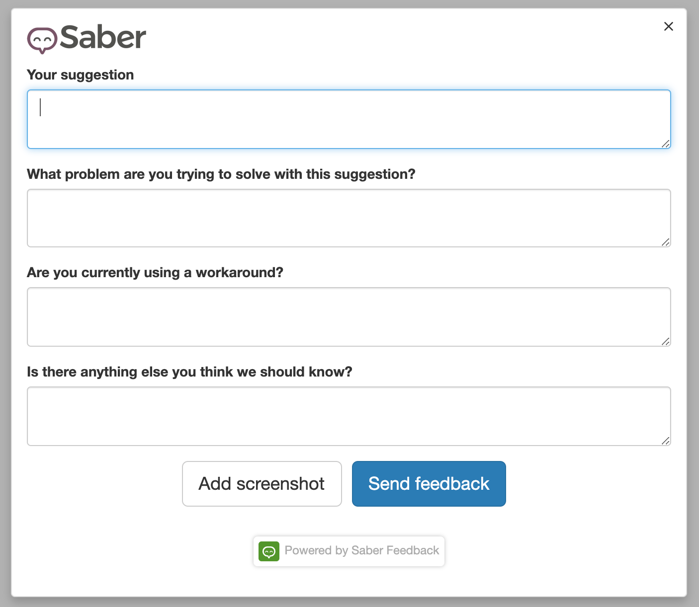
Feedback button tools let you create both general feedback forms and specific ones that ask for a certain type of feedback.
For example, you might want to track customer satisfaction ratings:
Or you might want to ask for feature requests and suggestions:
Here are 5 website feedback form templates to get you started.
Some feedback button tools allow you to add custom branding to your feedback button and feedback forms.
How can you improve the performance of feedback buttons?
To make sure you get precise, actionable feedback, try:
- Using a specific feedback button and form on pages where users are completing a specific action. This gets better results than using the same feedback form on all pages of your website, course or web app
- Tweaking the copy on your feedback button: ‘Report a bug’, ‘Feature suggestion?’ ‘How are we doing’, might all be more suitable
- Changing the position or style of your feedback button: at the bottom of the page might work better, or replacing the button with a question mark icon in your top navigation
This feedback button is at the bottom of the page:

Try Saber Feedback – 30-day free trial
Saber Feedback is easy to install, customise and connect to your other tools.
It has enough flexibility to be useful, but without all the extra complexity that adds to the workload of your team.

